Explore Airbnb data with R Shiny.
Introduction
I was asked to prepare a short training for colleagues in which I would teach the basics of R-Shiny and build a simple dashboard. I designed the training with the following question in mind: “how can I convey the most interesting aspects of R-Shiny while at the same time allowing people to get hands-on experience with an appealing and recognizable use-case?”. I answered this question with a use-case that involves visualizing Airbnb data for my hometown: Amsterdam. In this blog, I will explain R Shiny basics, and the steps I took to produce the following dashboard.
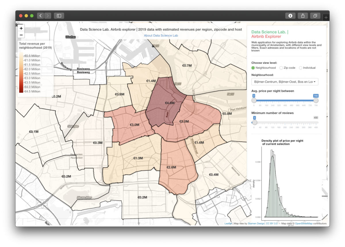
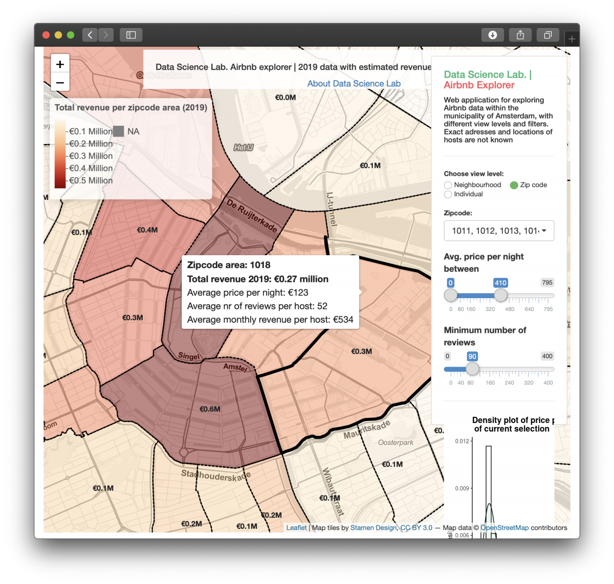
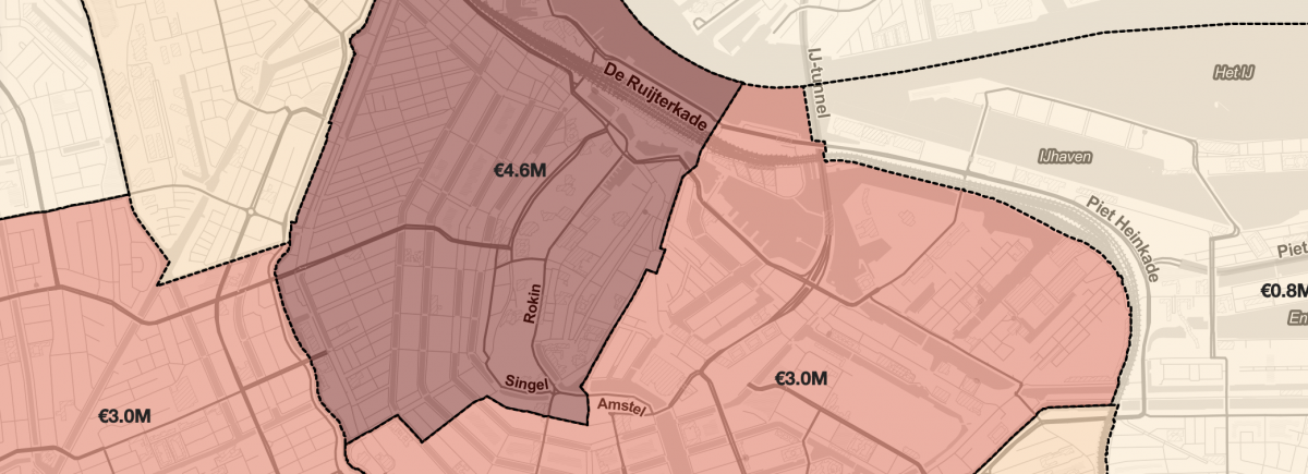
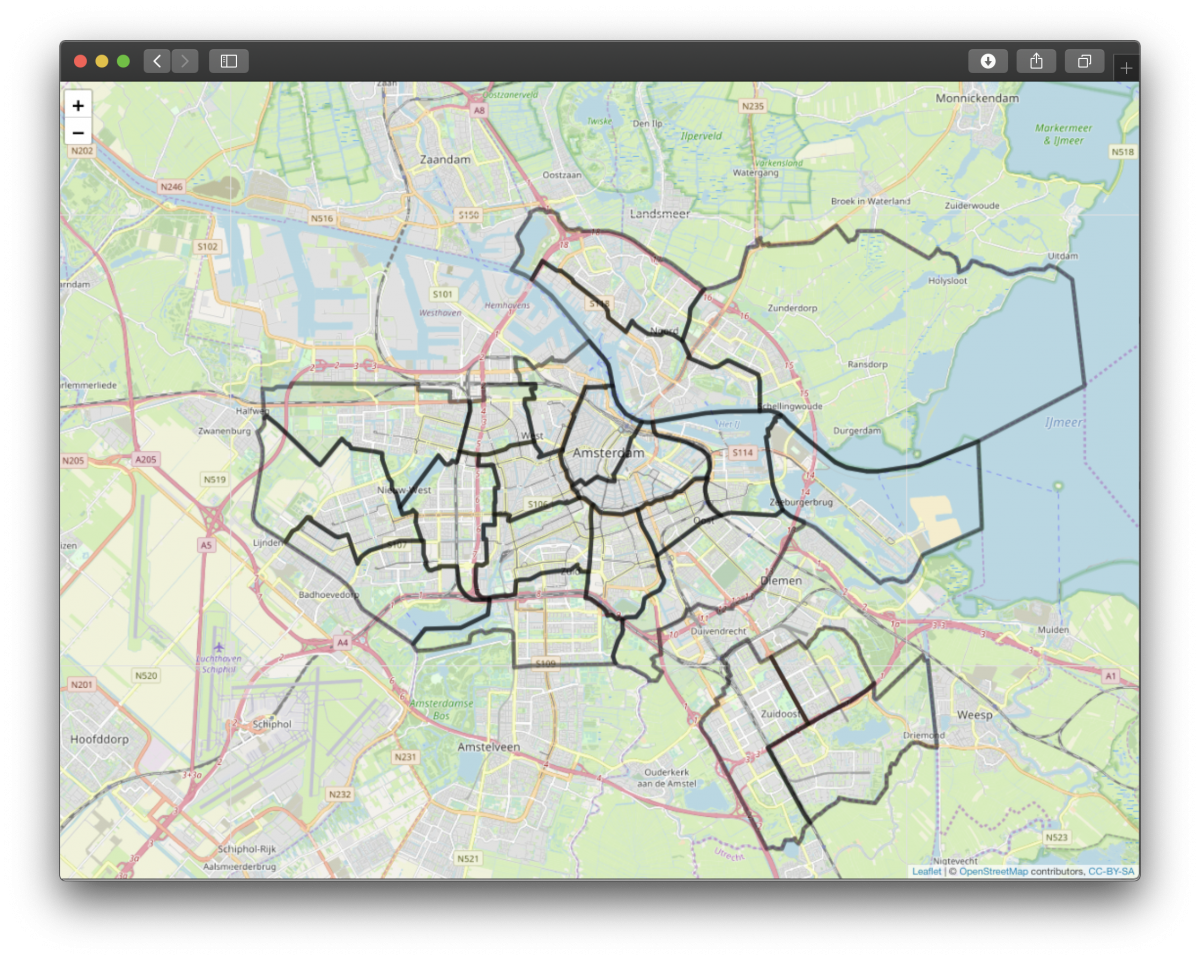
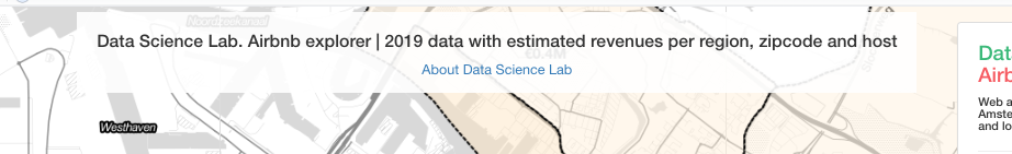
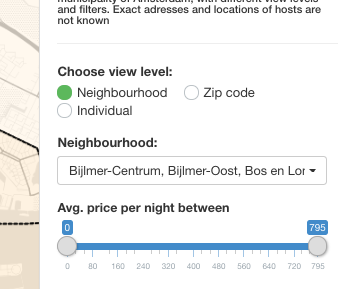
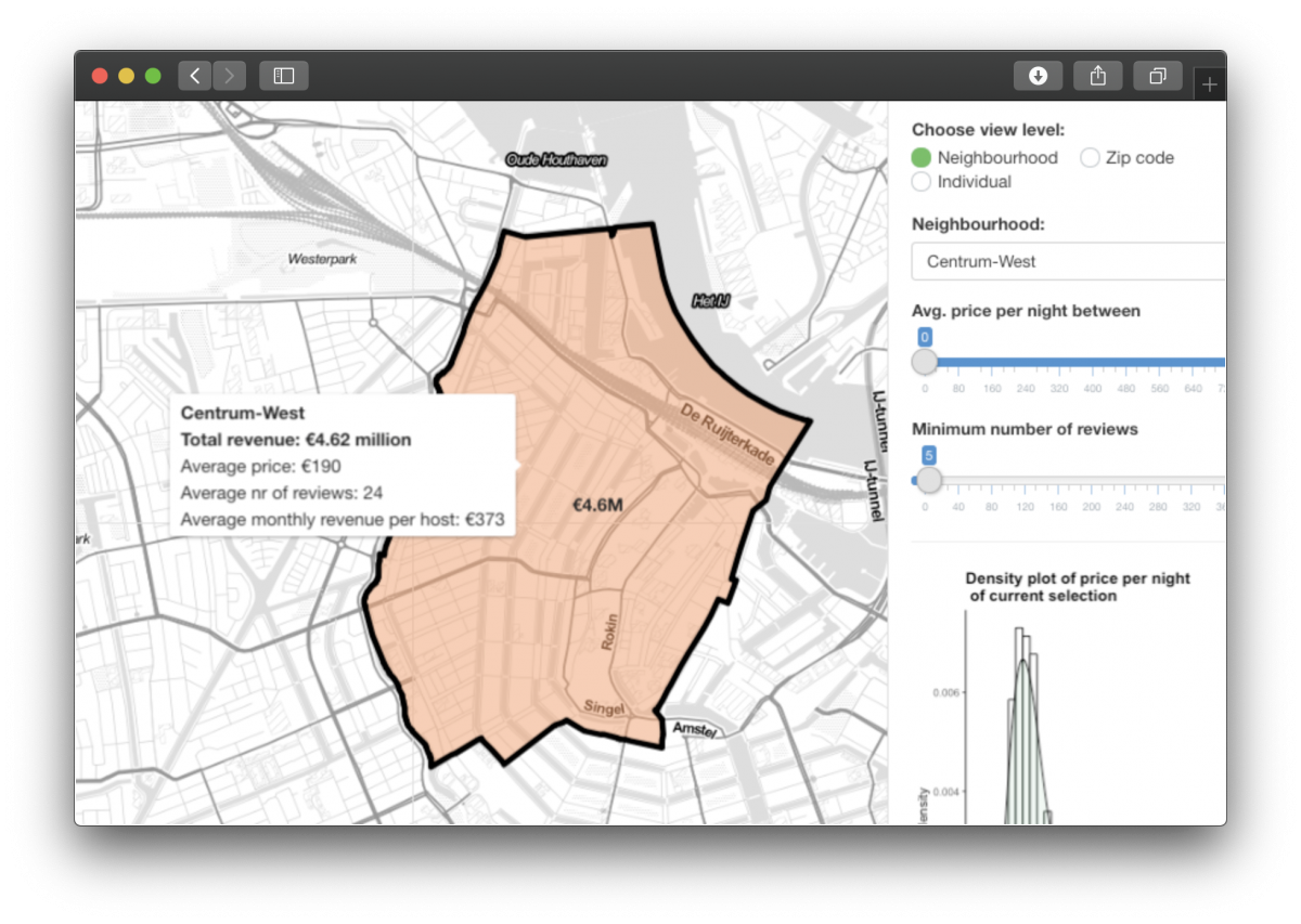
This dashboard shows a map of Amsterdam, with an overlay of geographical area’s (in this case zipcode areas), coloured by the total revenue these area’s made in 2019. On the right, there are some controls that allow a user of the dashboard to switch between different views, and to filter the data based on the average price or amount of reviews.
Tools and workflow
Tools used
- R/Rstudio
- Shiny
- ShinyDashboard
- Tidyverse
- Leaflet
To build this dashboard, first a map layer is build, after which the map is split up in certain regions (neighbourhoods or zipcode area’s). These regions are then coloured using the Airbnb data. I will go through this in more detail using the following steps:
Workflow (simplified)
- Get and transform data
- Building the app
- UI
- Server
-
Get and transform data
First, I had to get some data. I used data from the website insideairbnb.com. This website collects and utilizes public information from the Airbnb website. As a start, I used two files from insideairbnb.com:
- Listing.csv – summary information and key metrics for individual listings (Airbnb hosts)
- Neighbourhoods.geojson – GeoJSON file of Amsterdam neighbourhoods. This file has some simple geographical features. Of particular interest are the so called “polygons” of each neighbourhood. You can think of a polygon as the area that defines a specific neighbourhood (in this case). We use these polygons to draw the different neighbourhoods in Amsterdam.
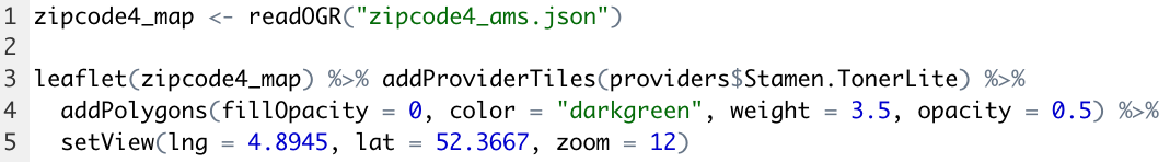
I also downloaded a zipcode4 dataset from the municipality of Amsterdam, to include a little bit more detail in our map:
- zipcode4_ams.json – json file that contains polygons of each zipcode4 area in Amsterdam.
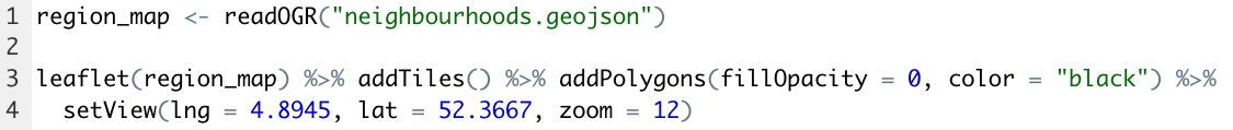
Features from the neighbourhoods.geojson file can be read in using the function readOGR, from the package rgdal. This function reads the data into a suitable spatial vector object. To build this dashboard, I use leaflet to draw interactive maps. Using leaflet, and the neighbourhoods datafile, a basic map of Amsterdam can be drawn, with the neighbourhoods included:
Different map styles can be used. This can be done by including “addProviderTiles”. This lets us use maps from different map providers, for example Stamen. The following code produces a map with Stamen tiles and zipcode4 areas:
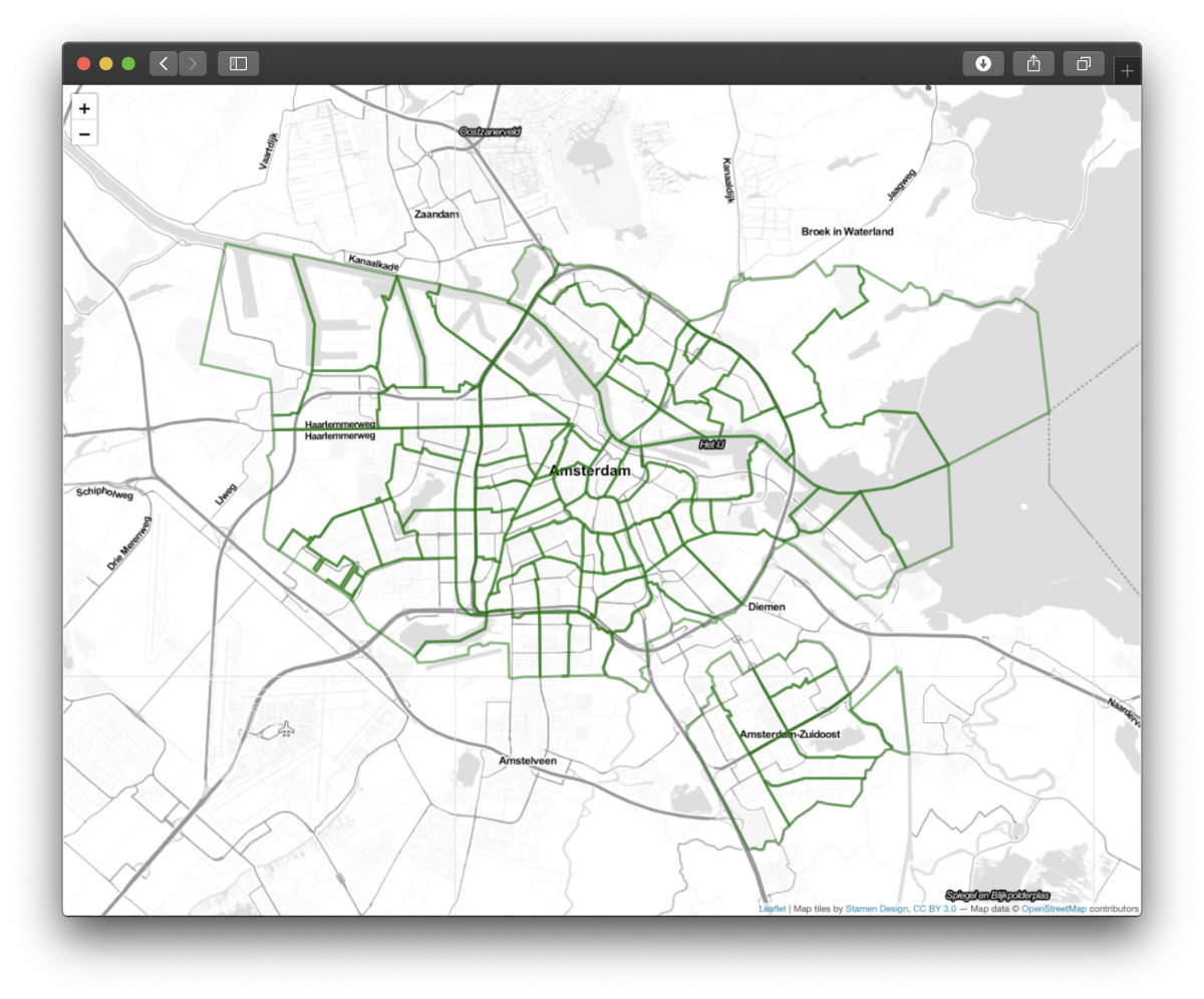
Having drawn simple maps, it’s now time to explore the Airbnb data:
Every row in the dataset is an individual host. Columns represent the following:
- Host name
- Neighbourhood (this one is important to “connect” our data with the map on neighbourhood level)
- Room type
- Price
- Number of reviews
- Reviews per month
- ….
In order to get a (very simplistic) estimate of the revenue made, I created some new columns with revenue estimates:

The data also contains the latitude and longitude per listing. Using these coordinates, I extracted the address* of each individual host using a Google Maps API. I then extracted the zip code per address using regular expressions. *Please note: this is not a very exact address as the dataset does not contains the exact coordinates per host, but coordinates with a small offset in order to protect privacy.
Let’s take a look at the dataset now:

After some more preprocessing, summarizing and aggregating (see code for full details), everything is now in place to build a fancy Shiny app. Let’s summarize:
- We have listings data, with some extra “revenue” features, and the corresponding zipcode and neighbourhood per listing
- We have a geojson file with polygons of Amsterdam neighbourhoods
- We have a geojson file with polygons of Amsterdam zipcode areas
2. App
Shiny is used to build the web application. Shiny makes it easy to build web applications straight from R. In order to build the app we have to create a single file called App.R, which contains two main important parts: a UI and a Server part. Let’s explore this a little bit more:
2.a UI
The UI side of the application controls the layout of the application. The UI part of the application also controls how a user interacts with our application. The first function in the UI script is the “fluidPage” function. This function creates a display which automatically adapts to the size of the browser window of the user using the application. Within the fluidpage, plots, texts and other HTML objects can be added. For example, we can create a title with the following code (with some CSS directly included):
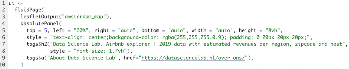
Note: in the code above, the short line: “leafletOutput(“amsterdam_map”)” is also included. This is one of the most important parts of the web-application, and is responsible for the fact that the Amsterdam map with all of its components is visualized.
Another important thing on the UI side is enabling the user to interact with the application. This can be done by including so called “inputs”. For example, the following code provides a slider with which the user can filter the data points:
2.b Server
The app server side runs a live R session. Here, the output needed for the UI side of the application is defined: in this case: how the map is displayed based on user input. Summarizing: we can see the “server” as a function with instructions on how to build and rebuild the R objects displayed in the UI.
Let’s start with the most important thing needed for the web application: the data. A so called “reactive expression is created”, which updates the data needed only when the user changes the input:
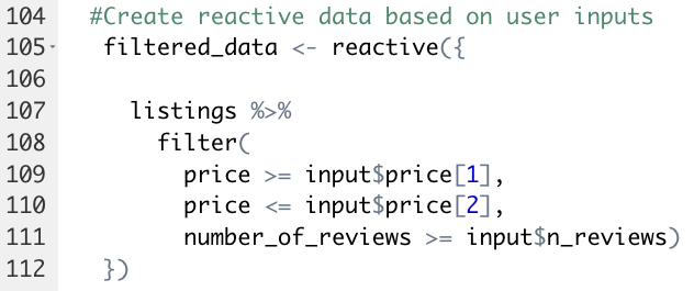
Why is this important? Using reactive expressions on the server side is what makes the web-application responsive: whenever a user changes an input (for example: select certain neighbourhoods) the application instantly updates itself.
The filtered data defined above is also used to create filtered data on a regional level, as well as on zipcode level. Again, a reactive expression is used to achieve this:
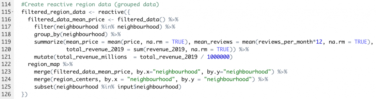
Let’s go through this:
Line 2:9: The filtered data set from the first reactive expression is used, then the data points are grouped together by neighbourhood (line 4) for which some important things, such as mean average price per night, are then calculated (line 6:9). The region map is then merged with the dataset on neighbourhood level (line 10:13).
So, what do we have now? We now have a region map, with only those regions selected by the user, with only those datapoints as specified by the user’s filters, combined with some important metrics such as the total revenue made and the average number of reviews. This is something we can work with, and this is what we can actually see when the map is drawn:
Conclusion
The main advantage of using R Shiny is that we can very quickly build an interactive web-application, with surprisingly little effort. What I personally like about R Shiny is that it is also very customizable. Shiny is perfect when you want to let users interact with your data, and for building (prototype) dashboards.
In this post, we touched upon building a simple web-application to quickly let users interact and play with data in a visually appealing way! Would you like to learn more: contact us at: https://datasciencelab.nl/contact/
Test the app below