In elementary school, you already learn how to read tables and complete them yourself.
In high school, making line graphs is often one of the first lessons during math.
But even outside of school or work, you are confronted with data visualization on a daily basis; on the news almost every day, bar or line charts are incorporated into news items, and many advertisements also try to reinforce their message by using them.A good visualization helps to convey information efficiently.
For example, a line diagram shows at a glance the current status of Corona infections in the Netherlands, without having to compare different numbers or do any calculations yourself.
If the line is rising, the infections are rising, if the line is falling, the infection rate is falling.
In this way, it is possible to quickly draw conclusions from a large amount of information based on intuition and insight.Without prior knowledge, it is possible for almost anyone to read different types of visualizations quickly and accurately.
But this has by no means been taken for granted.
In fact, the emergence of data visualizations as we know them today began only a few decades ago.
But where did it ever originate?
And where will it go in the future?
First visualizations
The very first data visualization is in a Turkish cave in the form of a wall drawing.
This wall drawing, estimated to date from 6200 B.C., is a map of the Neolithic village of Çatalhöyük.
In addition to buildings from the village, it also depicts a nearby volcano, which appears to be on the verge of eruption.
A map may not be the first thing you think of when you hear the word data visualization, but it is actually nothing more than a graph with an x-axis and a y-axis.
In this graph, all buildings (seen from above) have a set of coordinates that indicate exactly where the building is located.
The cave drawing in Çatalhöyük is considered the oldest map in the world.
Since then, maps have become increasingly accurate and uniform over the years.
The most obvious reason for this is that measuring equipment has become a lot more accurate, but the layout of maps is also largely the same these days.
For example, almost all maps have a scale, a compass rose indicating where north is, and a grid across the map with matching coordinates or markings.
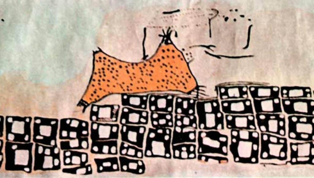
Figure 1.
The cave drawing of Çatalhöyük1
William Playfair – first line diagram
Besides maps, line charts are the first forms of graphs as we know them today.
The first line charts date back to the late Middle Ages and the 16th century, mainly recording the position of stars.
Yet William Playfair, a Scottish engineer and political economist of the 18th century, is often considered the founder of graphical statistics.
In 1786, he designed the line chart as everyone knows it.
He is also the inventor of the bar chart and the areachart and later the pie chart.
In Playfair’s line chart, two variables, English imports and exports to Denmark and Norway, are plotted against time.
The chart contains all the components that a modern line chart also has, such as axes with markings, a title and a brief description of what exactly the axes mean.
But there are also some stylistic points that make the chart less clear and would probably be handled differently today.
For example, the meaning of both lines is written directly on the line itself in a rather unclear way.
A legend could help with this.
In addition, the conclusion that can be drawn from the graph is already indicated in the graph itself with colored boxes between the two lines.
Nowadays a conclusion is often included in the accompanying text or the caption of the figure.
That the conclusion is not always indicated directly in the visualization itself, but can be extracted from it, John Snow proved in the next century.
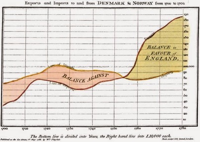
Figure 2.
Playfair’s trade-balance time-series chart2
John Snow – cholera
In the 1950s, the Soho district of London was ravaged by cholera.
At this time, people knew nothing about bacteria and germs, and the sudden emergence and cause of the disease was a mystery.
John Snow, a British scientist and later founder of epidemiology, decided to chart all cholera cases.
He did this because he hypothesized that contaminated water from garbage could well be the culprit.
On a map of the district, he indicated with dashes all cases of cholera.
This created a pattern where most of the cases occurred on Broad Street, here you could see a clear cluster.
Right on this spot was a water pump, from which many people in the neighborhood got their water.
This confirmed John Snow’s suspicions and traced the cause of the cholera outbreak to the pump on Broad Street.
Snow took a sample of the water and examined it, but without finding sufficient evidence that the contaminated water was actually the culprit.
Still, the drawing was convincing enough for the municipality to take action and put the pump out of commission.
This marked the end of the cholera outbreak in Soho.
The reason this example is often mentioned when discussing the history of data visualization is because it is one of the first known cases where a conclusion based purely on the visualization actually led to action.
In the end, this is what data visualization is all about: by displaying data in the right way, creating new insights or helping to frame them.
In the case of John Snow, drawing out all the cases on a map helped in precisely placing the source of contamination.
Figure 3.
John Snow’s London Cholera Map3
Emergence and future of data visualization
The development of data visualization has been in a tailspin since the 1950s of last century.
Especially since the introduction of the computer, a great many new forms of visualization have become possible.
Larger amounts of data and the predictions of computer models can be processed at once, which led, among other things, to new forms of visualizations, such as wordclouds.
As mentioned earlier, especially “old-fashioned” forms of visualizations such as line charts and bar graphs are still used daily in the news or in newspapers, partly because virtually anyone can read these visualizations without too many problems.
Data visualization today goes beyond just visualizing a bunch of data.
Using infographics, often a unique combination of multiple data visualizations.
By combining images, data visualizations and just a small amount of text, it is often possible to explain a complex problem or topic.
Another interesting development is that these infographics are often designed by visual designers, rather than just scientists as in the past.
When creating data visualizations, however, it is important to keep in mind that the reader perceives the visualization as designed.
So in a sense, you are left to the interpretation of the data by the designer, whether that is a data scientist or a visual designer.
The more complex the data or the more data are brought together in the visualization, the faster this can also lead to misconceptions, both on the part of the creator and the reader.
This is why it is important to always check for yourself whether the indicated correlation really indicates causation, especially since a good visualization is not necessarily based on good analysis.
Personally, I think that there is much to be gained in the future by bringing scientists and visual designers together, so that science can be conveyed even better.
The first steps for this have already been taken, with many companies setting up data teams where data scientists work closely with data analysts.
The next step is to involve creatives in this.